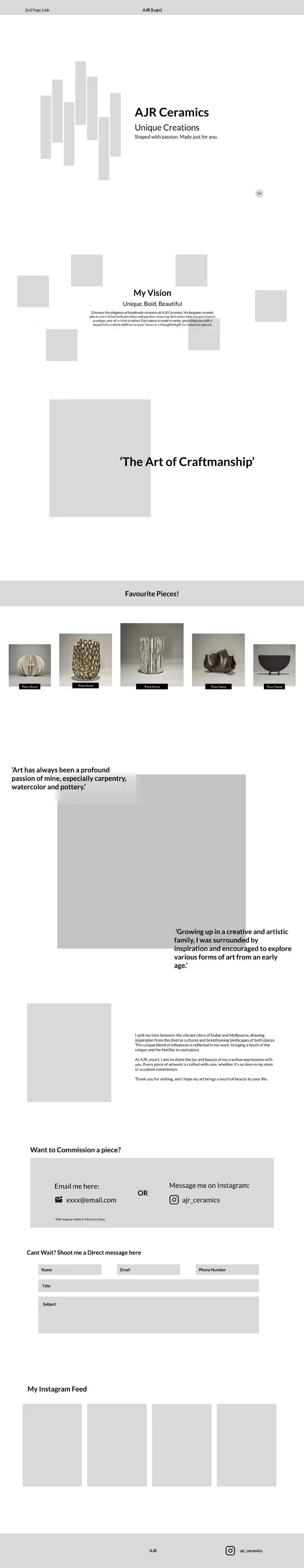
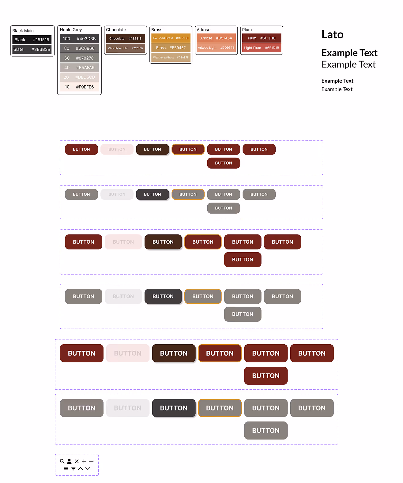
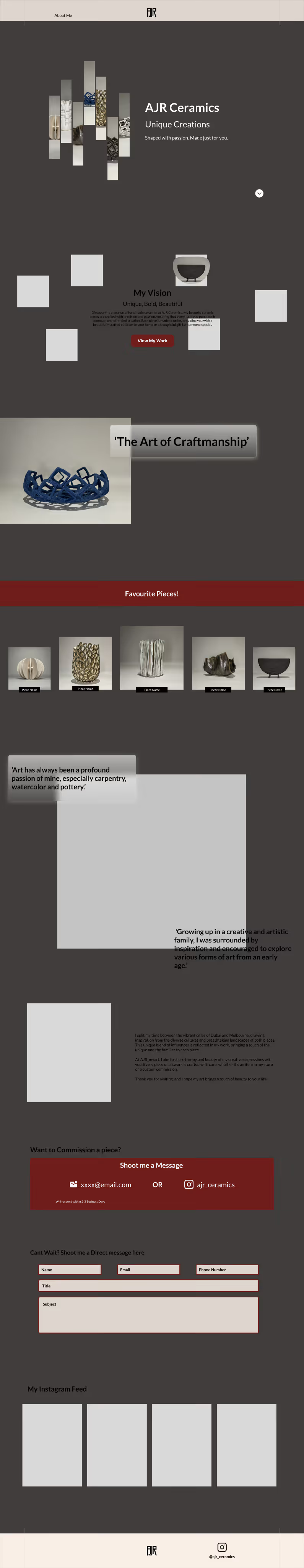
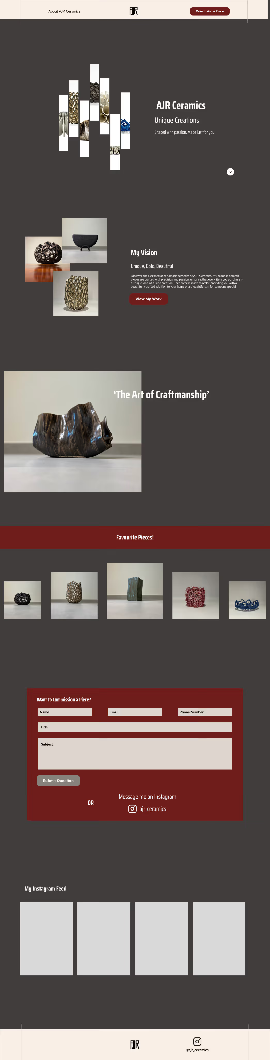
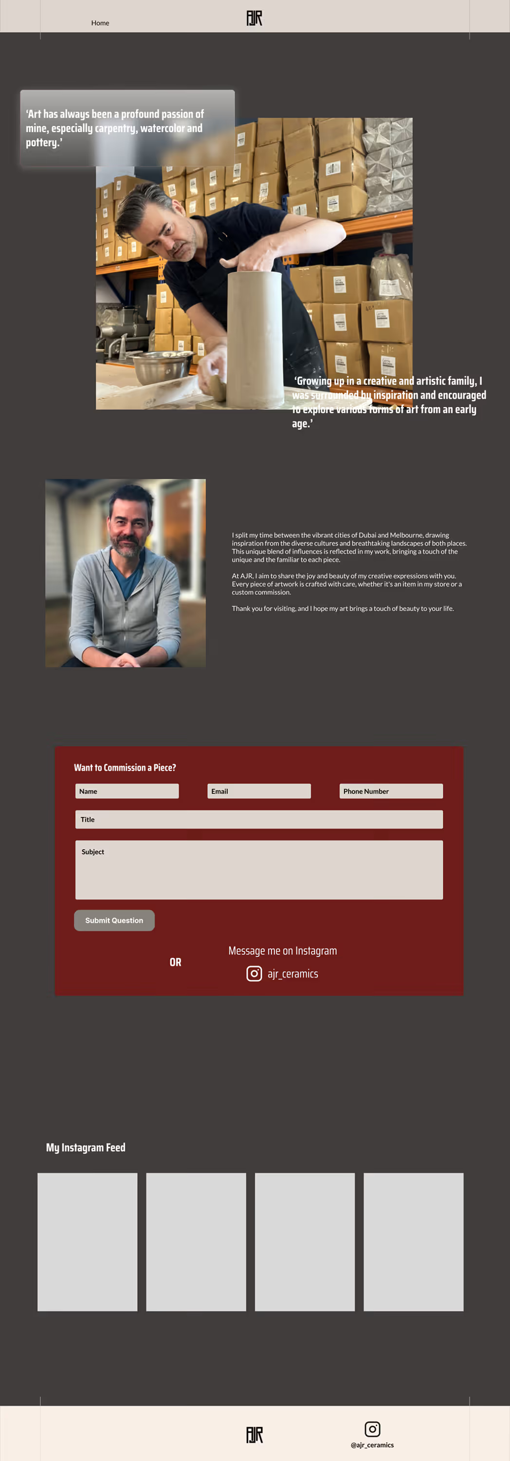
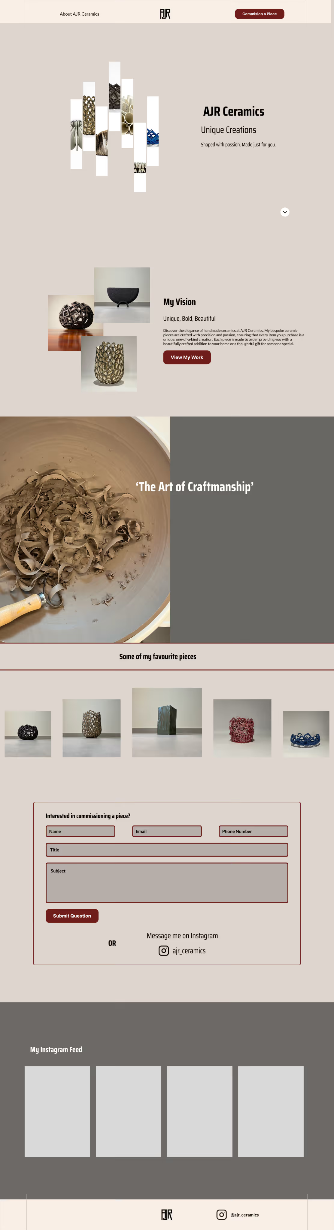
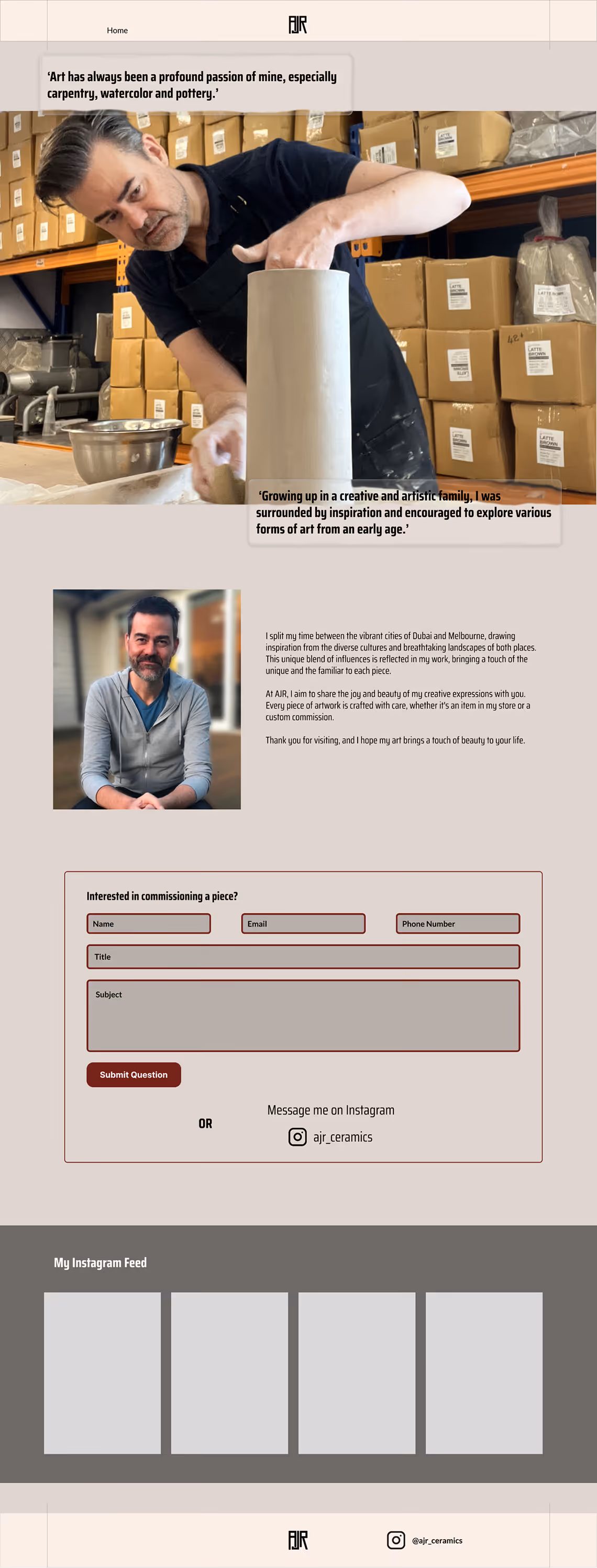
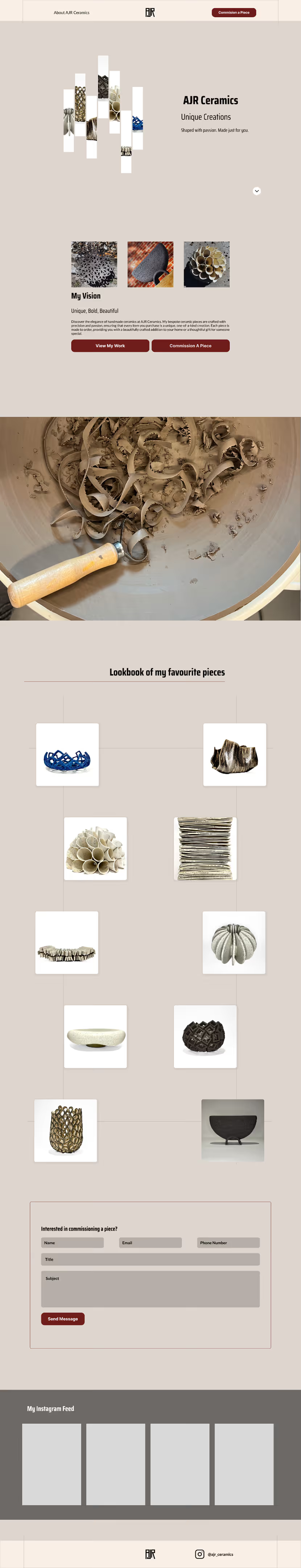
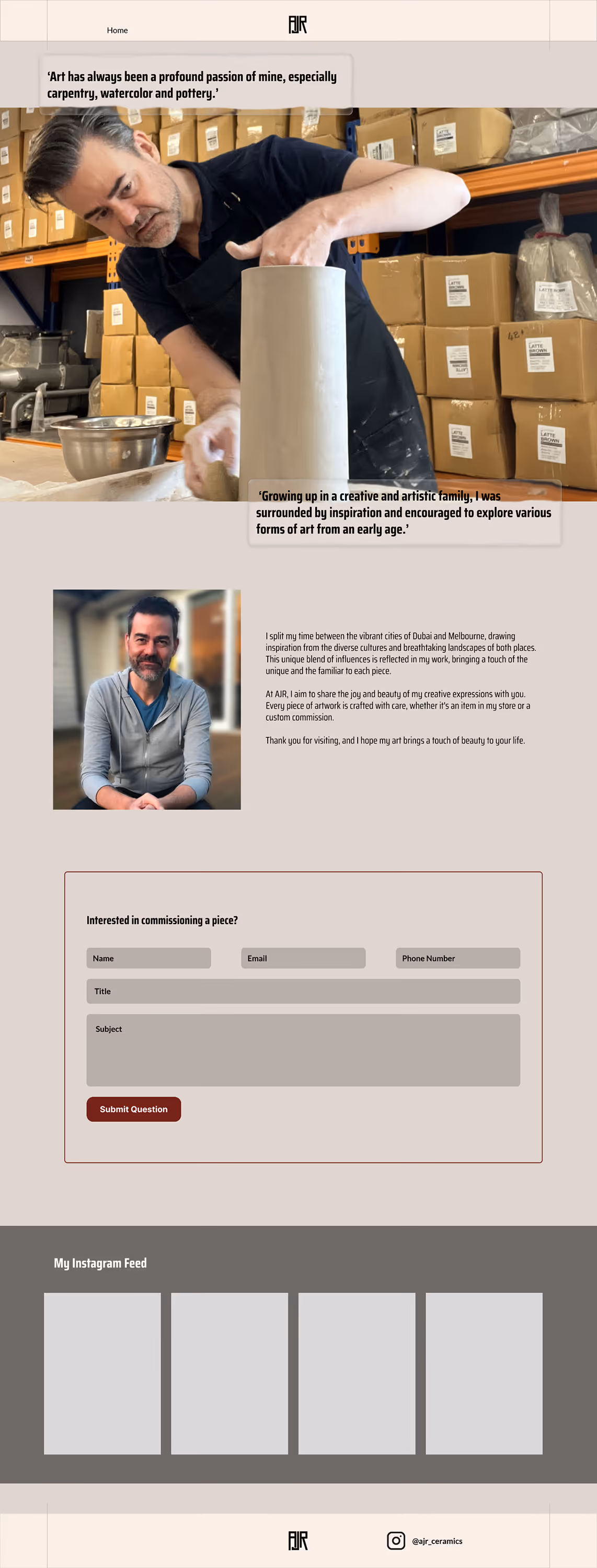
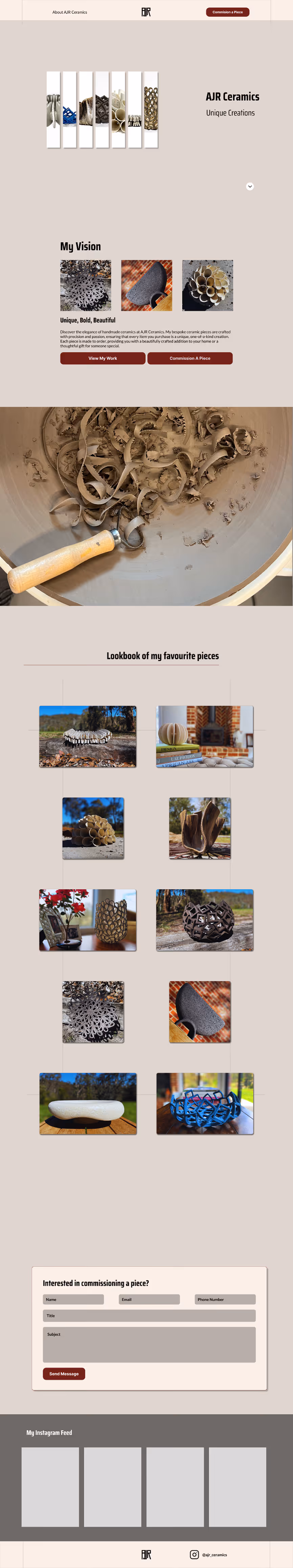
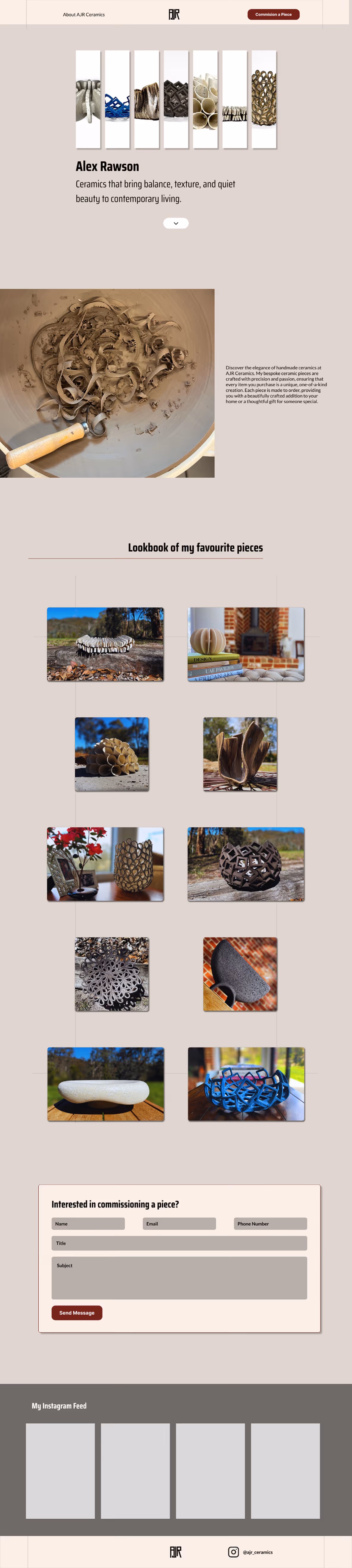
Header image for my Rebel Active application
AJR Ceramics
Role:
End-to-End Designer
Timeline:
Oct 25' - Jan 26'
Software:
Figma, Photoshop, Webflow
View Website
Problem
Despite growing interest on social media, the ceramics brand lacked a dedicated online presence to showcase both the artist and the work in a cohesive, professional way. Without a website, there was no central space to highlight past projects, tell the story behind the practice, or streamline commission inquiries. This made it difficult to convert casual followers into serious clients or collectors.
Audience
design-conscious individuals, art collectors, and interior enthusiasts who discover the brand through social media or word of mouth. Many are interested in bespoke, handmade pieces and are drawn to the story and craftsmanship behind the work.
Solution
I’m currently in the process of designing and developing a custom website that reflects both the artist’s personality and the quality of the work. Starting with a clean, minimalist layout in Figma, the focus is on creating a space that feels personal yet professional. The final build will be developed in Webflow, with features including a curated gallery, an artist bio, and a streamlined commission inquiry form. The goal is to create a seamless, engaging experience that helps turn interest into meaningful opportunities.
Project Constraints
Designing for a Client
This project was designed in collaboration with Alex from AJR Ceramics who I was consulting throughout the design and development phases
Design & Development
I had to gain new skills and workflows from this as I tasked myself with both designing the website in Figma and also developing it in Webflow
Designing from Scratch
Had no preexisting data or assets to work with. So had to work with the client from scratch to create something amazing

Research.

Getting to know AJR Ceramics

In the first few weeks of the project, I had several meetings with Alex to really understand what makes AJR Ceramics tick. These early conversations gave me a clearer picture of what he wanted from the site and helped me reframe the brief into a defined user and business problem. From there, I was excited to dive in and start shaping a solution that aligned with both his goals and his audience.

Moodboards

After my initial discovery meetings, I asked Alex to create two moodboards to help define the visual direction for the project. These moodboards were key in shaping a distinct color palette and style that aligned with both his artistic identity and the tone we wanted to set for the website.

SWOT Analysis

To better understand the space AJR Ceramics sits within, I conducted a SWOT analysis of similar websites, focusing on makers, independent ceramicists, and small shops that specialise in handmade goods. This helped me identify common strengths, such as strong product photography and storytelling, as well as weaknesses like confusing navigation or lack of personality. These insights gave me a clearer sense of what to lean into and what to avoid when shaping the site’s structure and tone.

User Surveys

At this stage, both Alex and I were still figuring out who the website and even his Instagram content was really for. To help us define the audience more clearly, I created and distributed an art-focused user survey. The goal was to better understand what would resonate with potential visitors and what kind of content would feel relevant to them. The responses helped us shape not just the tone of the site, but also how tailored the content needed to be.

Ideate.

Wireframing

To start shaping the overall direction of the site and communicate my early ideas to the client, I created an initial wireframe. This helped get the ball rolling, giving us a shared foundation to build on and opening up discussions around layout, structure, and key content areas.

Design System

Before jumping into a polished prototype, I worked closely with Alex to create a basic design system that would guide the look and feel of the site. We chose a clean, simple typeface and an earthy color palette that reflected both Alex’s personality and the natural tones of his ceramics. From there, I applied these styles to build out key components, including icons, buttons, and other interface elements, to ensure everything felt consistent and connected.

Prototyping

For this project, I worked closely with Alex to develop six distinct website prototypes across the design phase. Each iteration was used as a strategic tool to explore layout structure, content hierarchy, user flows, and interaction patterns, allowing ideas to be tested, refined, and validated incrementally. In this section, I walk through each prototype in sequence, highlighting the key UX considerations, design decisions, and insights gained at each stage, and explaining how these informed the final solution.

Prototype v1

This initial iteration explored a single-page website using a dark colour palette with deep plum accents to highlight key interactive elements.

However, consolidating all content onto one page resulted in a dense, cluttered layout that was difficult to scan. The dark background also reduced readability and led to an overuse of the plum accent colour, diminishing its impact and weakening visual hierarchy. These learnings highlighted the need for clearer content separation, improved hierarchy, and a more accessible colour approach in future iterations.

Prototype v2

This second iteration retained a similar colour palette to the first, but shifted from a single-page layout to a two-page structure to reduce visual clutter and improve content hierarchy.

Layouts were refined to support easier scanning, and the landing section was updated to introduce motion, adding visual interest and helping the entry point feel more engaging. At this stage, I was still uncertain about the effectiveness of the glassmorphism treatment on imagery and the dark background overall. However, I continued with this direction to align with Alex’s initial preferences, while planning to reassess these choices in later iterations.

Prototype v3

This third iteration marked a clear shift in the project, where the colour system began to align more closely with the intended user experience. The background was updated from a dark Noble Grey to a lighter variation, improving readability and reducing visual heaviness.

Plum red was repositioned from a primary background colour to a secondary accent, used selectively for buttons and line work. This strengthened visual hierarchy and allowed key interactions to stand out more effectively. At this stage, the design began to move in a clear and confident direction. After walking Alex through the colour rationale, he responded positively and contributed additional suggestions that further refined the solution.

Prototype v4

This iteration marked the point where the core structure of the project was firmly established. The use of plum red was further reduced and reserved primarily for high-impact calls to action, reinforcing its role as a purposeful and attention-driving accent.

The initial “favourite pieces” carousel was also re-evaluated, as both Alex and I felt it limited content visibility and interaction. Through research and ideation, this component evolved into a lookbook-style layout. This approach provided greater spatial clarity, allowing both the page and the individual pieces to breathe, and positioned the work itself as the clear focal point of the experience.

Prototype v5

Building on the foundation established in v4, this iteration focused on smaller refinements aimed at improving overall clarity and usability. One key change was the removal of the glassmorphism and text, as it added visual complexity without providing meaningful value, and reduced content clarity.

An additional “Exhibitions” section was introduced on the About page to further showcase Alex and his body of work. At this stage, the lookbook layout was finalised, alongside the selection of higher-quality imagery that more accurately represented and elevated Alex’s pieces.

Prototype v6

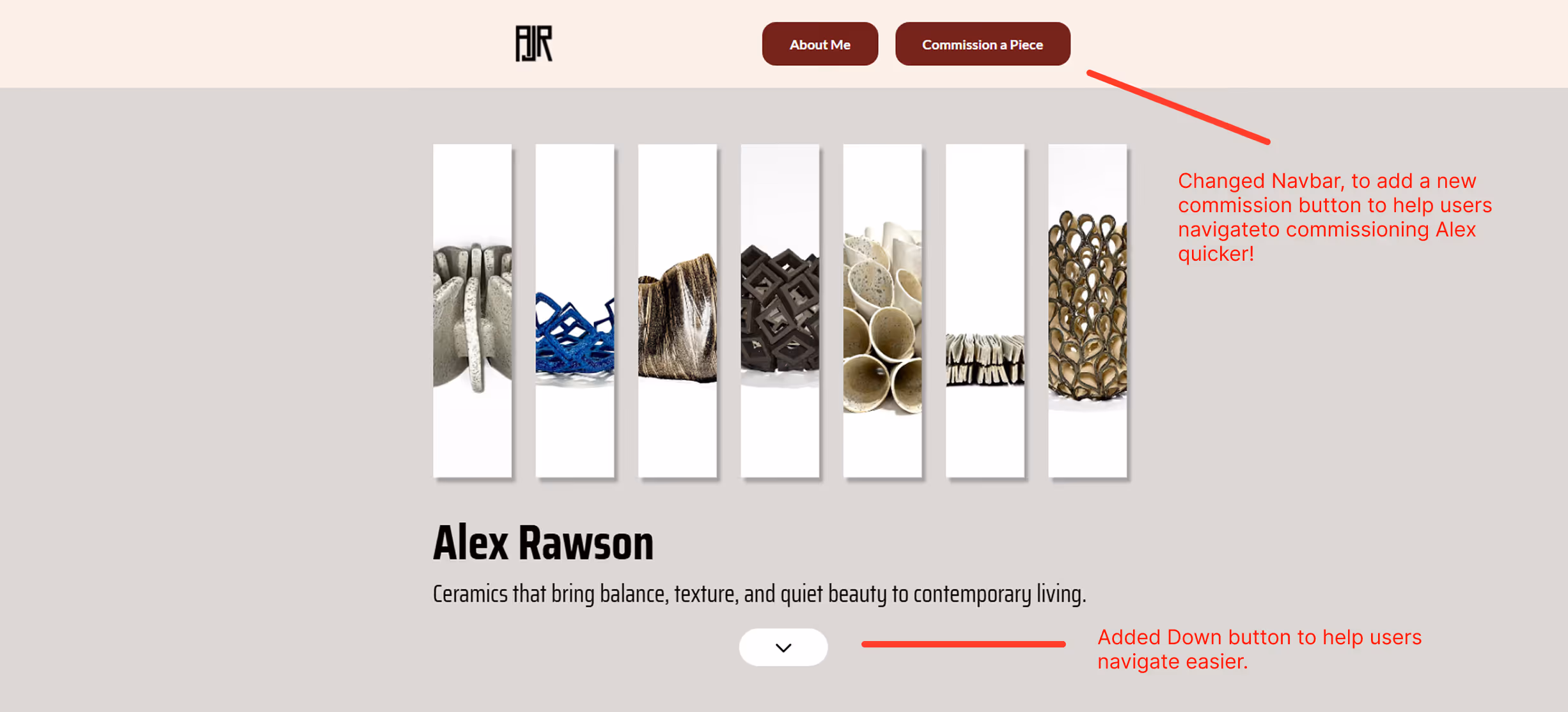
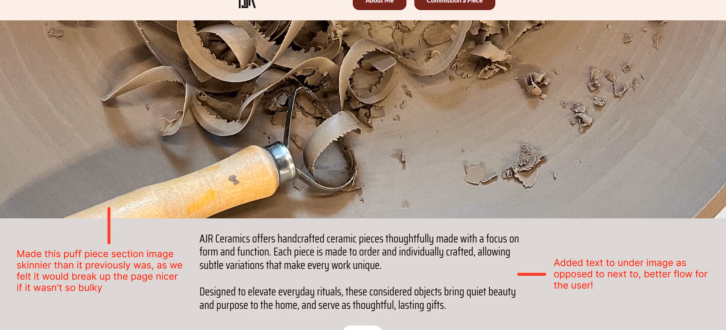
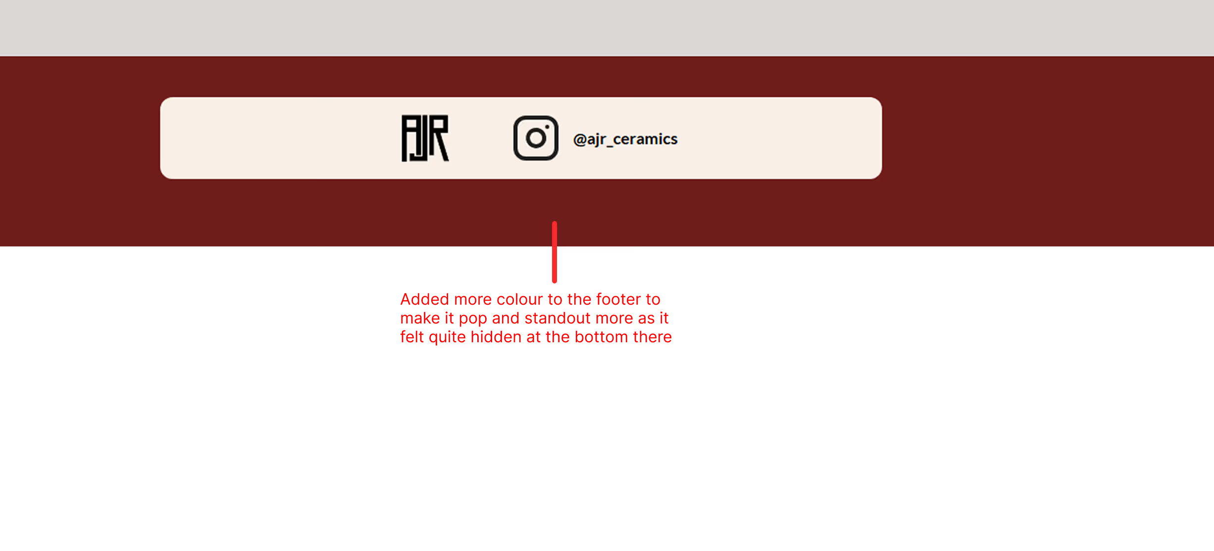
This final prototype was the version presented to Alex, incorporating only minor refinements. These included the addition of supporting text beneath the landing section, which was later removed, and explanatory text beneath the loading animation on the landing screen.

Overall, this iteration represented a strong convergence of the project’s visual direction, structure, and interaction patterns. While I was highly satisfied with the outcome at this stage, the concept continued to evolve during development, which I expand on in the following section.

Transition to Development

With the final prototype approved, the project moved into the development phase, where design decisions were tested against real-world constraints, performance considerations, and implementation details. This stage required refining interactions, adjusting layouts, and evolving certain components to ensure the experience translated effectively from prototype to production. The following section outlines how the design continued to adapt during development, and the key decisions made to preserve both usability and visual intent.

Development.

Figma → Webflow:

This part of the project was the most daunting for me, as it involved moving my Figma designs into a live Webflow build.However, I quickly found the transition to Webflow far more straightforward than expected. Because I had already set up repeatable design systems and consistent auto layout structures in Figma, I was able to transfer layouts with minimal friction. In many cases, this felt almost like a direct copy-and-paste process, with the designs translating cleanly and accurately into Webflow.

Development Changes

Like I said in the v6 prototype description, they weren't my final changes to the website and here are a few of those changes now!

Make it Responsive:

Given that a significant portion of traffic was expected to come from Alex’s Instagram, it was essential to prioritise a mobile-first approach and ensure the site performed seamlessly on smaller screens.

Responsiveness was carefully considered across all breakpoints, including mobile, tablet, and smaller desktop screens, to ensure a consistent and reliable experience across devices.

The Final Website

All right, here it is the final website for AJR Ceramics ill include a little video run through and also a link below to the finished site for you to enjoy!

This was a super fun project where I learnt ALOT along the way about both myself and my skills as a designer!
View Website
Reflections.
1.
Learnt a lot about myself and my skills in both design and working with clients/people which was invaluable!
2.
Saw how important having early stages setup with things like colour pallets and design systems can really make life SO much easier later on in the design process
3.
Properly figured out how to design a concept fully in Figma then translating that concept by developing it in Webflow. Which I was daunting as it seemed like a big mountain to climb. However, that mountain was actually a lot smaller than I realised once I got stuck in!