To design an innovative smartphone app and research tool that is scalable, which can be used for collecting and examining consumer feedback about optimal and suboptimal healthcare design.
Audience
Focused on improving the quality of feedback from employees and patients of hospitals to improve and better the spaces they work / live in.
Solution
Designed a feedback application, that was accessible for anyone to use while also providing users with the tools and options to navigate the app and leave feedback with ease.
Project Constraints
Strict Deadlines
Had 12 weeks to finish this project with strict deadlines in place for check-ins throughout the project.
Designing for Stakeholders
Constant check ins and feedback from key stakeholders for the client we worked for, meant an ever changing landscape of the scope we were designing for
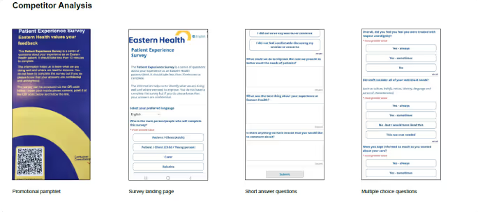
Research
Design Inspiration
A Mixture of literary reviews and competitor analysis lead us to a strong base in HOW and WHY we are designing
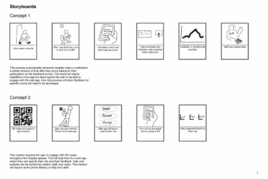
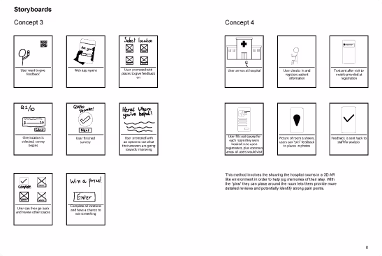
Storyboards
We struggled initially to truly get our head around the concepts we were generating. In order to combat this we create 4 different storyboards which are all based on different concepts. We did this in order to get both our creative and decision making minds flowing!
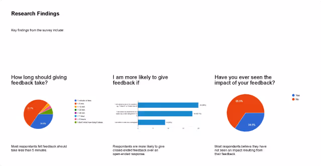
User Interviews and Surveys
Conducted extensive user surveys to gather diverse opinions on topics such as ideal feedback response times and whether users felt their feedback made an impact.
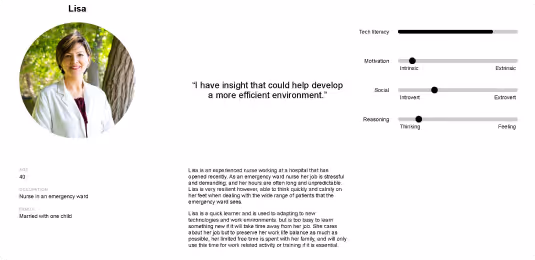
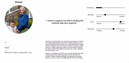
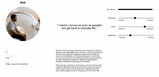
Persona’s and Heuristic Evaluation
The user surveys and interviews helped us develop three key personas representing our potential stakeholders. These personas provided a solid foundation for beginning the design process and considering usability heuristics.
Ideate
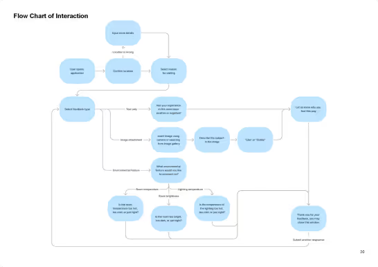
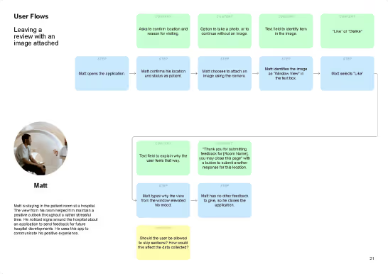
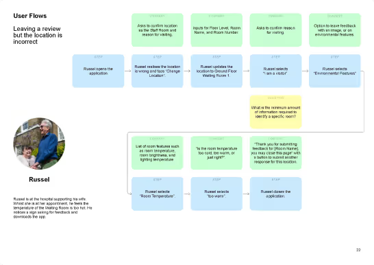
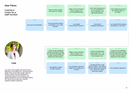
Flow Chart of Interaction and User Flows
We began the ideation phase by creating an overarching interaction flow chart. From there, we developed user flow maps for each persona, outlining how they would complete different tasks within the application. This process helped us identify and eliminate potential friction points from a usability perspective before starting user testing.
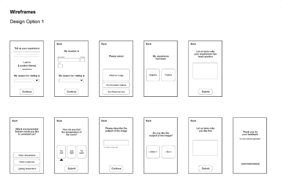
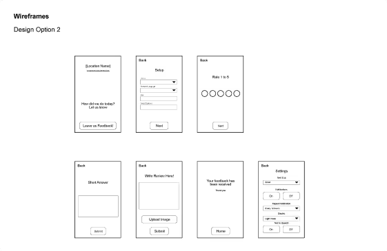
Wireframes
We created two wireframe options, A and B, to explore design diversity, ultimately selecting Option 2 for the final design.
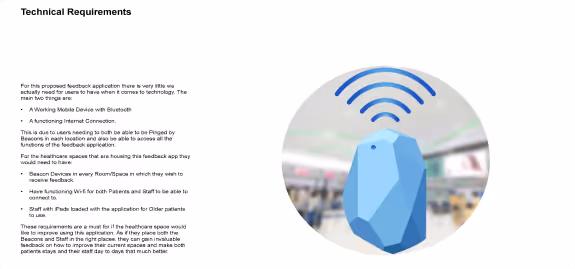
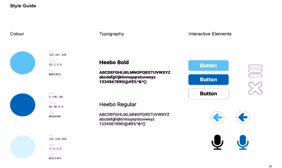
Requirements and Style Guide
As this was a client project, we provided them with a list of technical requirements necessary for the efficient use of our application. Additionally, we delivered a style guide that defined the visual aspects of the app, ensuring consistency throughout the design.
Final Prototype
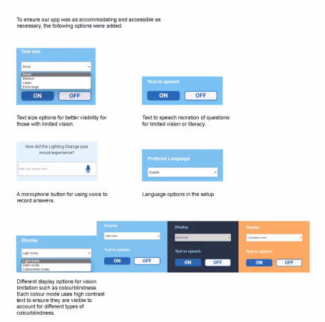
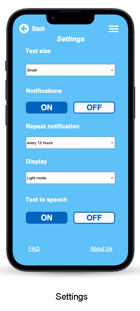
Accessibility
One important aspect we addressed before the final handoff was accessibility. Since the app would be used in healthcare settings, we ensured that all visual options and settings were both accommodating and accessible to a wide range of users.
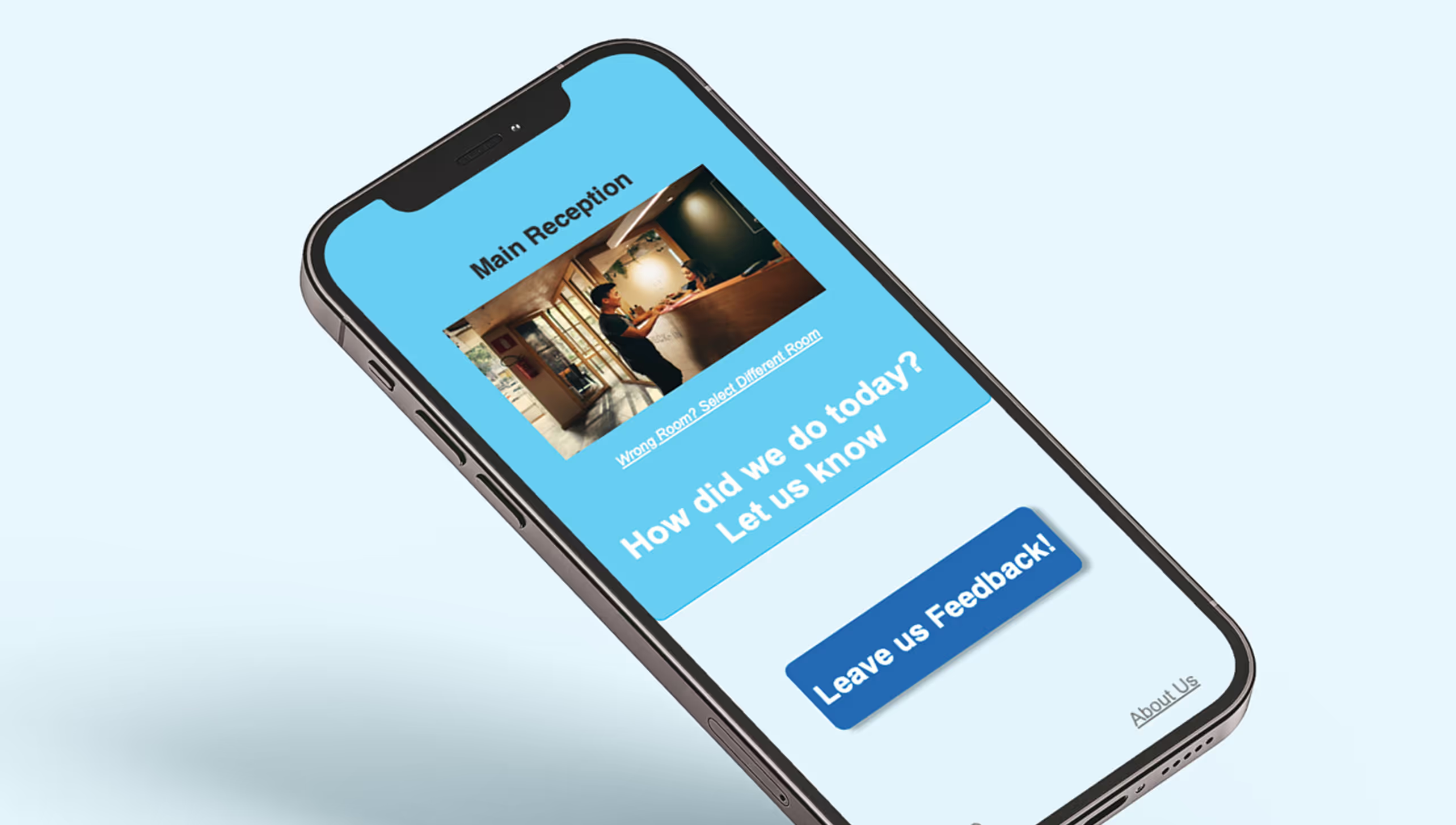
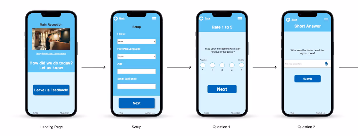
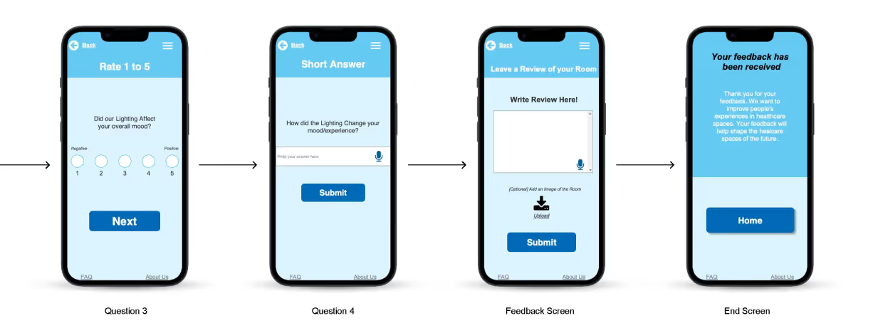
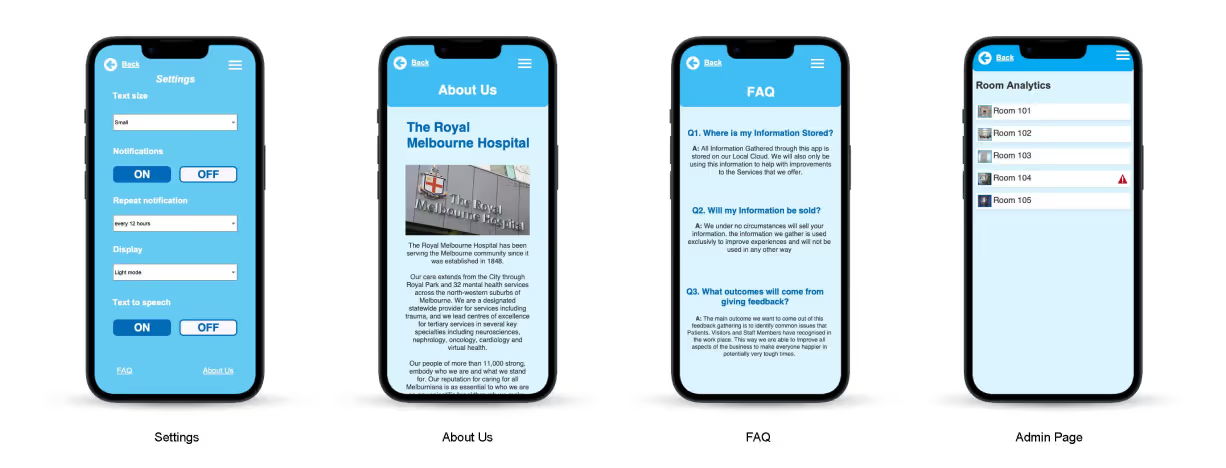
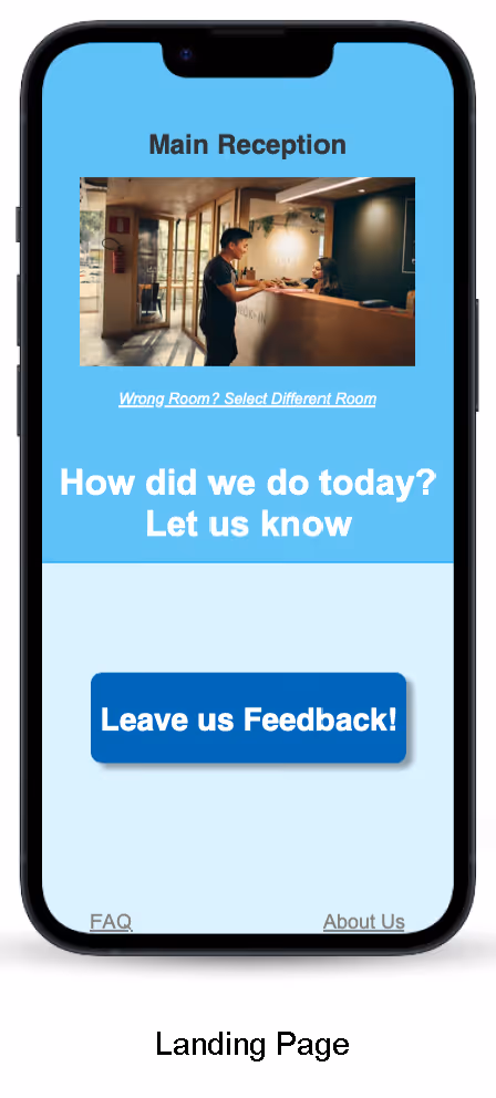
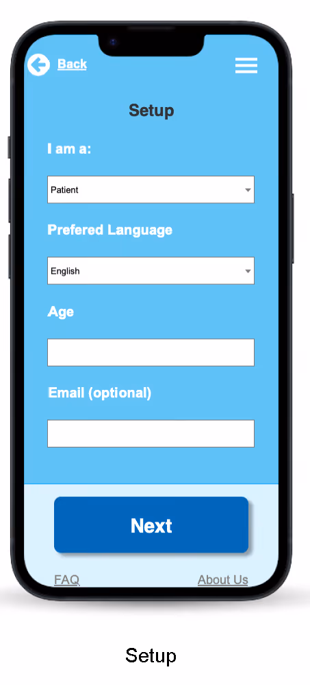
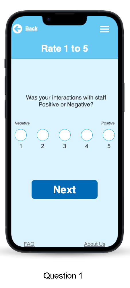
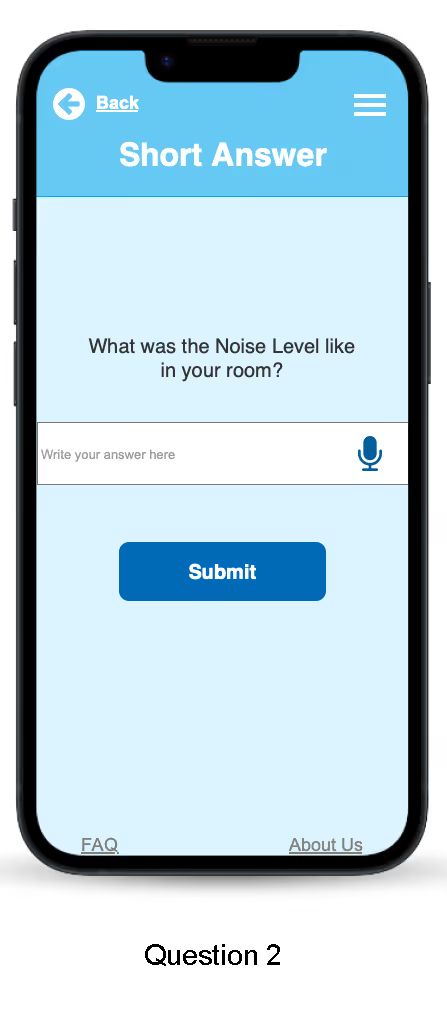
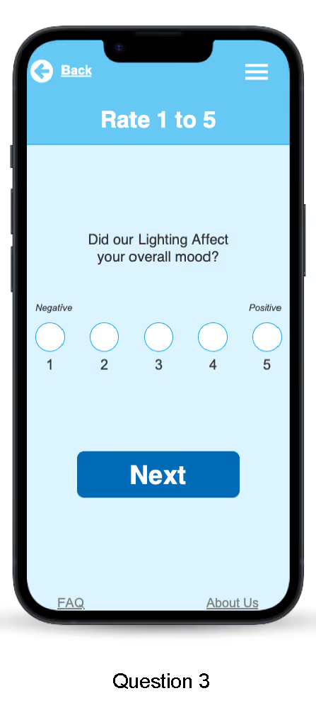
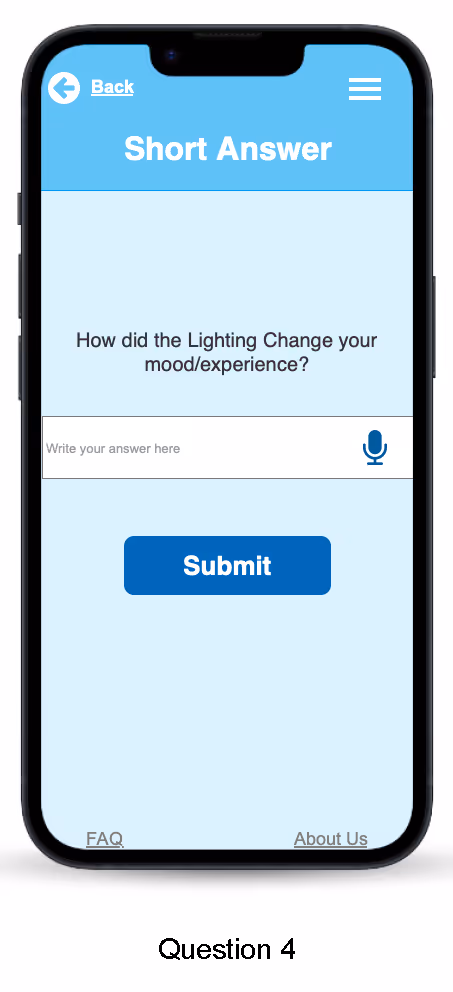
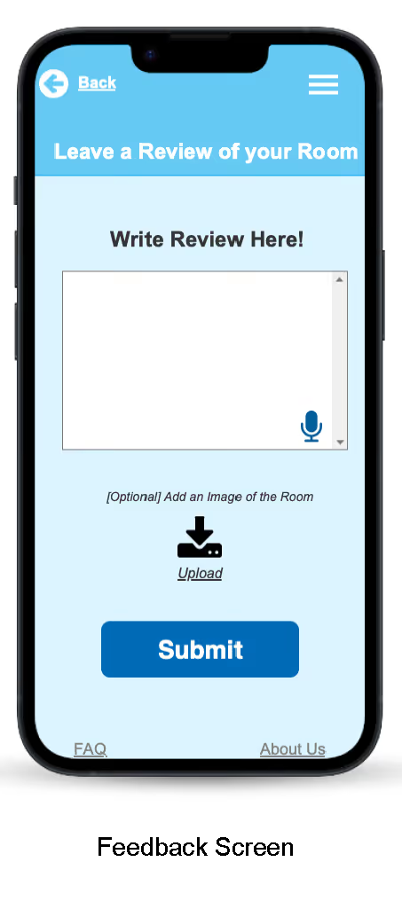
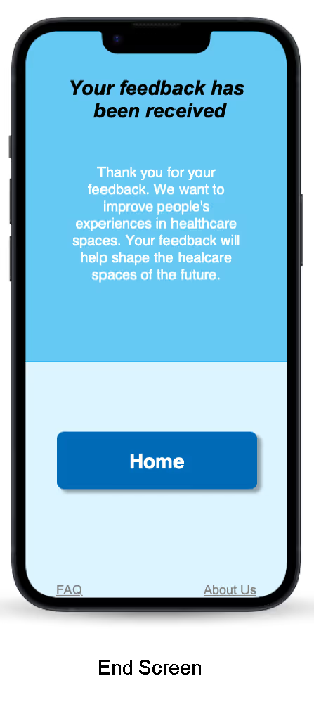
Key Screens
Reflections
1.
How to work in a challenging team. Due to the nature of the people I worked with on the projects, we were all on clashing and differing schedules at the time so it was hard to find the time to really sit down and flesh things out. However, it wasn't impossible, we figured out ways to work around this and created something we are all super proud of!
2.
Accessibility is key to getting valid feedback, as everyone is different and has different levels of tech literacy. It was key to figure out how to designed with a wide range of stakeholders in mind
3.
Collaborating closely with key stakeholders taught me how to create a product I can be proud of and that they can confidently use, whether in part or as a complete solution.